After years of working for a large company, Ben could hardly wait to set up his own business. Knowing the demographics of his market area, Ben wanted to market to the large Latino population there. So, he looked up the keywords in Spanish and created a beautifully designed website and colorful, eye-catching signage to attract new business from the surrounding Spanish-speaking communities. Then he decided to hire his former coworker Carlos – who grew up in a bilingual home – to handle potential customers who felt more comfortable doing business in Spanish. The catchy bilingual sign Ben came up with turned heads as well, but not for the reasons he expected.
[gap height=”15″][gap height=”15″]
¿Qué Pasa?
[gap height=”15″]
Business was underwhelming, at first. Latinos who did stop in were genuinely surprised to find an employee who could speak their language because the sign out front contained “Spanish” words that were misspelled, missing accents or even non-existent! For instance, the Spanish word “servicios” was spelled as “servicies” instead.
[gap height=”15″]
Ben didn’t think much more about it until another Spanish-speaking lady came by to say that she was confused about one type of business offered because of a literal translation of “umbrella” as something to do with the device that keeps the rain off of you, not an encompassing service. While Carlos took the extra time to explain this to her, Ben suddenly realized that his seemingly minor mistakes were costing him business. As soon as he replaced all the signs inside and outside of his office – not to mention reprinting flyers and updating his website – at substantial cost, Ben’s profits picked up tremendously.
[gap height=”15″]
Experienced signage professionals say some of their toughest jobs involve deliberately misspelled words, such as “Korner” or “Qwik,” which are meant to be catchy and attract attention, because they require extra quality-control steps. And if they’re making signs containing foreign languages, they usually ask their clients to have them proofed by a professional translator. Sign-creators make sure the design is right, but most are not language experts, as well.
[gap height=”15″][gap height=”15″]
Signage that Sells
[gap height=”15″]
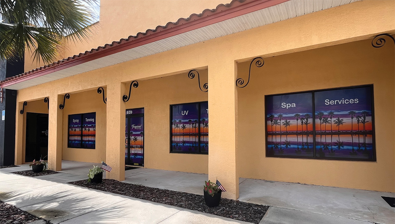
As a business owner, your signage speaks volumes about you. It’s that first impression that will either encourage someone to step through your door – or click on your website – and take a closer look at what you have to offer. Here are some tips to make sure your signage sells:
[gap height=”15″]
Make your stand-alone storefront stand out. Your logo and/or trade name should attract attention. Be sure to fully brief your designers: Who is your target customer (walk-in, passerby, drive-by, all of the above)? Ask for their advice about the appropriate font style and size for each piece of information and each kind of sign they make you. Remember to include your address number, phone number and website on the sign as well.
[gap height=”15″]
Be consistent. Brand recognition is key, and consistent signage will help you build a recognizable brand that people will remember. Make sure your branding is on everything – from the sidewalk signs advertising special sales to the teardrop banners you use at trade shows. If your brand always speaks with one voice, more folks will remember your name for word-of-mouth referrals.
[gap height=”15″]
Show them the way. Design branded, way-finding signs that are concise and unambiguous. Make it easy for anyone to find you and less likely to find one of your competitors.
[gap height=”15″][gap height=”15″]
Speak their language.
[gap height=”15″]
Do many of your customers speak English as a second language? Consider hiring bilingual staff and announcing loud and clear—on your signs! —that your business can assist them in their native language. If nothing else, consult professional translators who specialize in your industry to ensure your marketing materials send the right message. Studies show that people prefer to shop in their native language.
[gap height=”15″]
Keep them safe. If you employ people with limited English proficiency (LEP) or cater to LEP customers, you’ll not only help prevent workplace accidents, you’ll also win over staff and customers by having safety signs printed in their native/dominant language. Make sure to use professional translators with experience in occupational safety. They will not only ensure your signs send the right message; they can also make sure that message fits the sign, as letter-spacing and other nuances may need to change depending on the target language. Note that the US Occupational Safety and Health Administration provides the “It’s The Law” safety poster in several languages for free at: osha.gov/Publications/poster.html. And don’t forget that some U.S. states and territories have their own signage requirements. Check whether yours is one of them at osha.gov/dcsp/osp/index.html.
[gap height=”15″]
As a business owner, the last thing you want is for your signage to turn people off before you even have the chance to meet them. Your signs say a lot about your business – your expertise, attention to detail and overall competency. A well-designed, consistent and flawless message across your print and digital media will build positive brand awareness, get people in the door, and ultimately boost your bottom line.
Brand recognition is key, and consistent signage will help you build a recognizable brand that people will remember.


